
Give It Volume With Value
So you have your drawing all cleaned up and ready to go. You’re happy with the lineart, composition, character design, etc. It just needs some coloring. Now what?
Don’t just slap some flat color on it. GIVE IT VOLUME.
You create the illusion of volume using value gradations to communicate light and shadow. Value is also known as black, white and all the grays in between.
Using value gradations, meaning light and shadow, makes objects look 3D (as though they have mass and exist within three dimensional space), as opposed to looking flat and 2D.

So yes, what I mean is add some shading to your drawings, y’all.
But I refer to it as giving it volume because I don’t just mean put some cell shading on it and call it a day. When I say give it volume, I mean you should really understand the way light interacts with the forms you’re working with. This separates the pros from the novices. When you understand how to really give your drawings volume, it means you really know what you’re doing.
I see this mistake a lot, which I’m as guilty of as anyone:
Being shy with your shading. You’re afraid of making a mistake, so you put as little shading on your drawing as possible. (In this particular drawing I didn’t even define a light source, so it looks really off!)
The problem with this is you don’t really know what you’re doing, so you’re taking the easy way out and avoiding the problem. What you need to do now is stop and take some time to learn about volume, value, and how light behaves in real life.
Here’s where you can start:
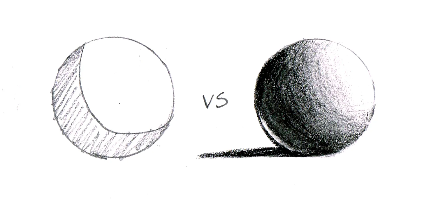
You’ve probably seen this classic sphere example before. Here you see how light behaves on rounded forms. You see where the light source is coming from and how the shadow follows the shape of the sphere, gradually changing from lightest to darkest. You see the cast shadow and reflected light.
The best way to learn to see and understand value is to draw from life. I recommend setting up a still life and drawing it (with pencil and paper) several times, changing the position and intensity of the light source. Use simple objects at first, like rounded fruit, boxes and cone-shaped items to make it easy on yourself.
It can be hard to separate color from value, as working from life means you’re seeing color as well as value. When you’re drawing, try to imagine that you’re looking at your still life as a black and white image. Do your best to focus on drawing the change between light, dark and mid tones as you see it.
You’ve probably also seen a grayscale before. The classic exercise starts out with white and black on the ends, then the student fills in the slow gradual change from white to black. Generally you put in the mid-tone in the center first to help you gage how light or dark the next squares should be.
The reason for this exercise is to help your eyes see the nuances within a grayscale. The point is to be able to look at an image and discern which is your lightest, darkest and mid tone.
Is this boring? Probably, but it’s super helpful in learning to create the illusion of volume in space, so bear with me. This will help you get better at drawing, I promise.
After making studies from life, you’ll start to have a much better understanding of the way light and shadow work. You can now use this knowledge to create a much more convincing illusion of light and shadow in your own drawing, thus giving volume to your work.
Start by breaking down your objects into basic shapes. Go from largest to smallest.
Define your light source and make a study (or several, if you want) to define how the light would fall on your broken-down objects.
It’s up to you to decide how much contrast you want.
Then apply what you’ve learned from your studies to your more complex drawing.
My sketch is quick and rough, but you get the idea. The point of breaking down your image into simpler shapes is to help you better understand the way light and shadow would behave on such a shape. Once you have a better understanding of the basic shapes you’re dealing with it become easier to move on to smaller, more complex shapes.
It’s pretty clear that adding light and shadow makes the image much more interesting and attractive, even if the style I used is relatively flat and simple.
Your work will always look better when you use references, but I think before you start getting into using references you need to have a basic understanding of volume and value. Once you have that, it’s much easier to interpret what you see in your reference and apply it to your drawing. If you don’t know what I’m talking about, don’t worry about it right now. Start by practicing the above exercises and be patient with yourself.
Related:
SAT #16: Draw What You See (Step 1)

