
Create Your Own References

I used to think setting up a still life or taking reference pictures required some kind of unknown skill or sorcery that only professionals and wizards had access to. Once I went to college, though, I found it only takes a blanket, some interesting objects/ model, and some lights. It’s not mysterious or complicated and it doesn’t take more than a bit of effort on your part (and maybe also the help of a friend).
No matter what your project is, you should always prepare before you go past the thumbnail stage. By prepare I mean do your research and gather references. Gathering references is not as hard as it sounds. Sometimes creating your own is easier because it gives you complete control over it. All you have to do is set up something similar to what’s in your head and take some pictures.
If you’ve looked online and tried all sorts of Google image searches but can’t seem to find quite what you need, that’s when you know you need to peel yourself away from your computer and take matters into your own hands!
You don’t need a fancy digital camera to do this. I’ve used my webcam and my camera phone before.
If you’re struggling with figuring out the anatomy of a particular pose at a particular angle, take a picture of a friend in that pose from the angle you need your picture from. If the pose permits it, you could take a picture of yourself using a tripod or some stacked boxes or whatever you have available. Similarly, if there is a certain hand gesture or folding of the arm, etc. that you’re not sure how to draw, you can save yourself a lot of mental strain and anxiety by taking a picture of the real thing to reference.


Here is an example of what the same pose looks like from several different angles.

For things like group shots, a couple dancing, people fighting, etc. it’s incredibly helpful and time-saving to get some of your friends or family to pose for you so you can snap a few reference pictures.
If you need to see what something looks like under specific lighting, find that object or something similar to it (or a model) and point your light source at it (you could use a lamp or a cheap clamp light or even a flashlight). Depending on how dark you need the room to be, you can turn the other lights off or close the blinds, etc. The darker the room, the starker your contrast between light and shadow will be.

For this picture I turned the lights off and pointed a light close to my hand (if you want your light to be softer, you can cover your light source with a plastic bag or some kind of thin fabric. It’ll turn into a nice glow instead of a beam of light. The heat of your light could possibly burn the plastic or fabric, though, so be careful).
If you want to use a backdrop, all you need is a blanket or a piece of fabric in the color you want your background to be and something to hold it up. I usually use push pins to pin the fabric to the wall or onto a cork board. You can also control the lighting to be whatever you want. It might take a bit of tweaking—turning a lamp on, closing a blind, adding another lamp, etc. but you’ll find it’s not so hard to do and you’ll be glad to have control over these things.

In these examples the backdrop is a dark sweater of mine and the fabric on the bottom is an old blue scarf. You could use anything as long as there is enough fabric to cover most of your composition.
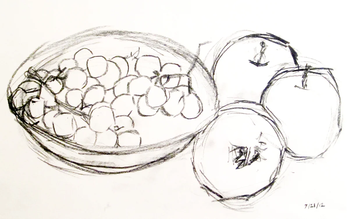
In a still life, you decide what objects you want to use and how to arrange them (I’ve found some awesome still life props in the dollar section at Target). Play around with the composition until you get something that looks interesting. If you have a pre-existing idea of what you want, you might find some other interesting options to consider in experimenting with your setup a bit.
If you’re using a model, set up a chair or whatever kind of prop you need in front of your backdrop. If you don’t need props you can just sit on the floor.
For portraiture, you may or may not want to use a backdrop. I don’t generally use a backdrop for portraits because I like to emphasize the face, so the background doesn’t really matter.

You can play around with your image’s contrast, levels, and saturation in Photoshop to best suit your project. The picture on the left has high color saturation, which exaggerates the color intensity. It also has high contrast, which exaggerates the separation between light and shadow. The second image doesn’t have very high saturation and moderate contrast.
You don’t have to base your color scheme off of you reference. As you can see on the image on the right, even though my reference image had natural colors, I used violet and cadmium red deep for the painting.
But, if you want, you can play around with the color and condition of your lighting, too.


For this picture I taped a folded sheet of red cellophane to my light and turned the lights off to get that intense contrast in color.

Whenever you make new references, it’s a good idea to take more pictures than you need for that one project. You can add the unused pictures to your reference library/folder (which you should definitely have!) for later use. Seriously, start building your reference library. You’ll be glad you did.
I hope this makes you feel more comfortable with the idea of creating your own references. If I missed something or if you would like me to expand on something mentioned here, please let me know!