
Learn the 6 Principles of Design
It’s important for you to know the principles of design so you’re aware of all the components you have control over when you’re designing your composition. Having this knowledge will help you make intelligent decisions to create the effect you want.
Reference: Design Principles & Problems (second edition) by Paul Zelanski and Mary Pat Fisher
6 principes of design are:
repetition
variety
rhythm
balance
emphasis
economy

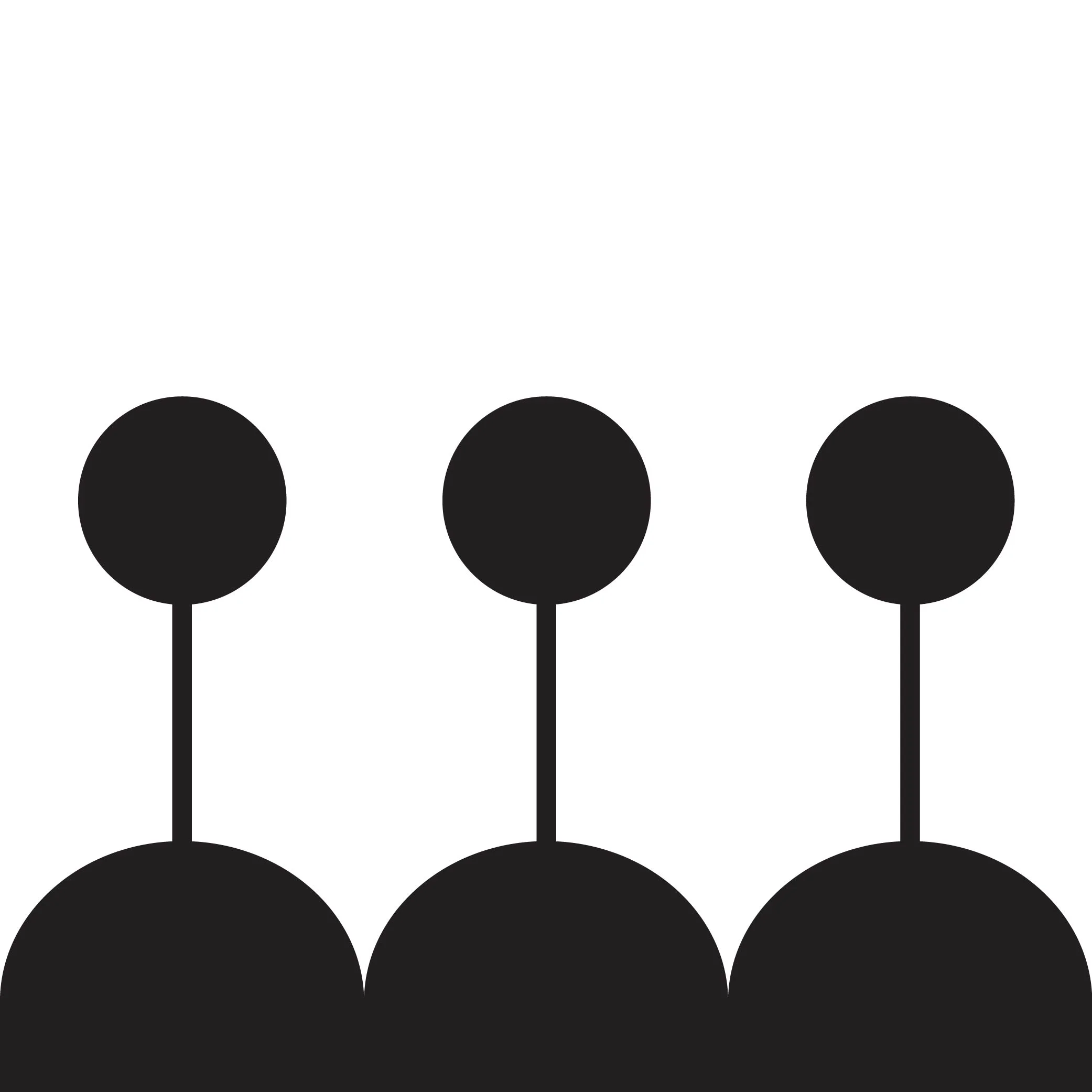
Repetition
Creates patterns and sets up a coherent rhythm. It can be done through repeating the same shape, color, texture, stroke, etc.
Repetition establishes a visual language within a piece, which creates cohesion and harmony. Because repetition happens in the real world, it gives us a comforting sense of familiarity.
Examples:


Repetition put into practice:


These are a few examples of repetition present within a single image.

Variety
Makes things more visually interesting, while exact repetition can become monotonous and boring. Variety can be created by varying the scale (size), color, value, texture, etc. of repeating elements within a piece.
Examples:


Variety put into practice:


To create variety within this garland design, I varied the shape and scale of the flowers.

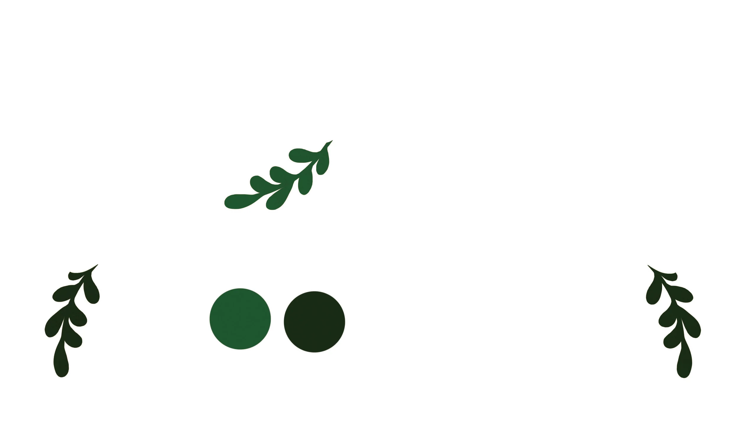


For the leaves I used three different shapes and three shades of green to create variety using very few elements. This saves time but also creates cohesion within the design.

Rhythm
Visual rhythm is created through repetition and variety. Rhythm can be slow, fast, consistent, inconsistent, etc.
Examples:


Rhythm put into practice:


In this piece, a consistent and even rhythm is created by the careful balancing of shapes and elements within the composition.

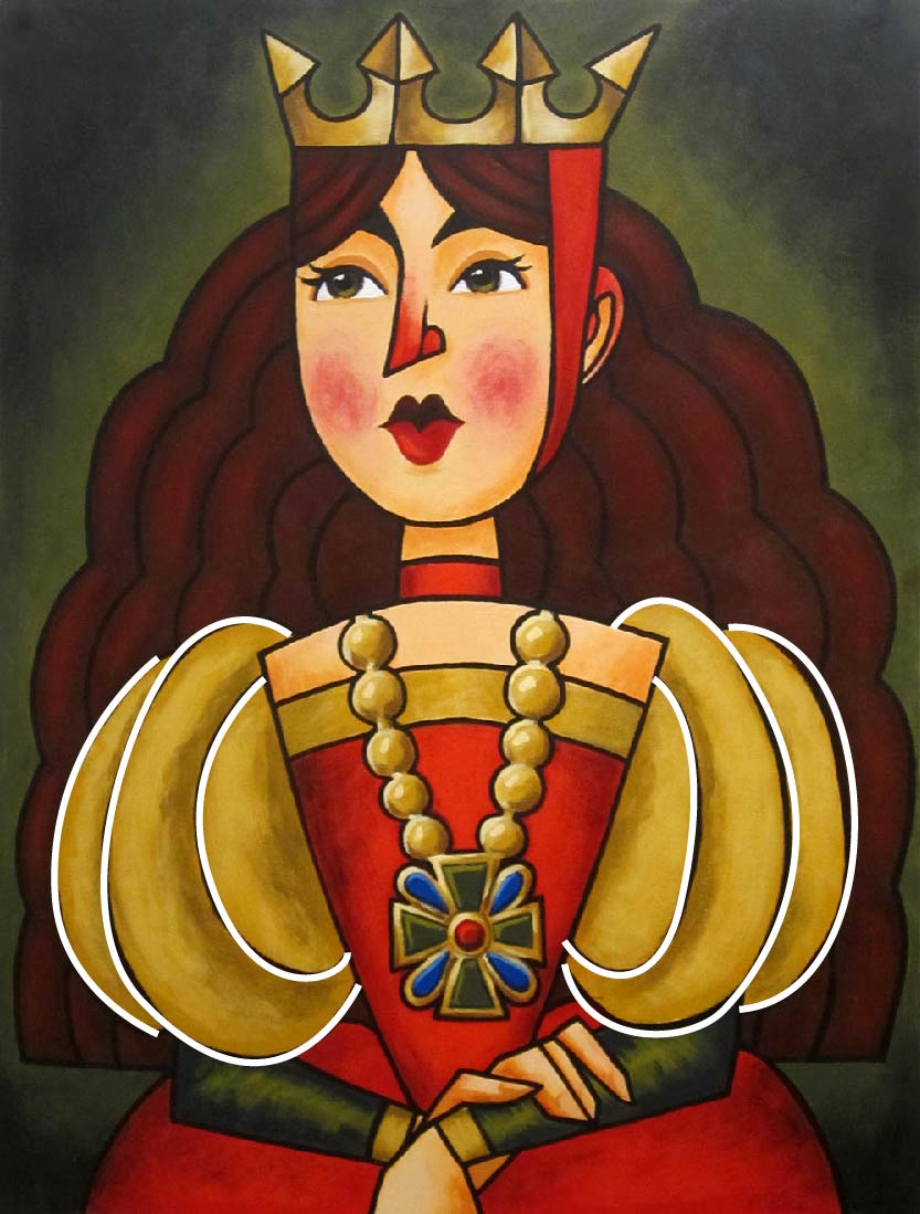
Balance
Visual balance can be symmetrical or asymmetrical.
Perfectly symmetrical compositions runs the risk of being boring. Usually a bit of variety is enough to make a symmetrical composition more interesting.
Examples:

An image is symmetrical when the visual balance is distributed equally, creating a mirror image.


An image is asymmetrical when visual balance is achieved through counterbalancing.
Balance put into practice:


This image is almost perfectly symmetrical, but the few variations added create enough variety to make it interesting and appealing.

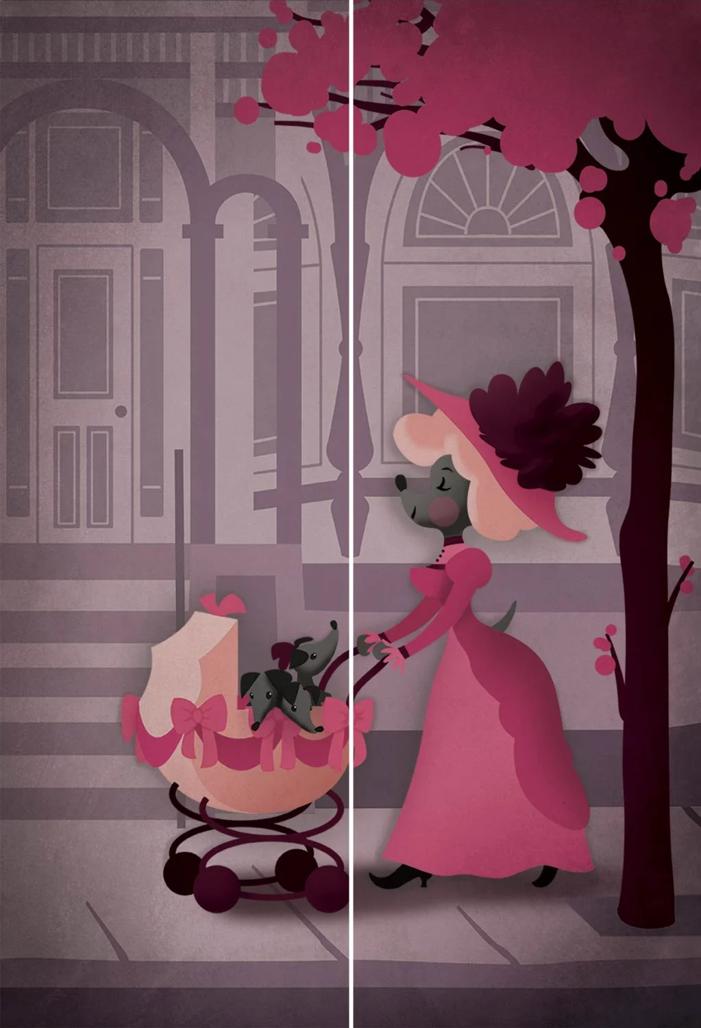
This image is clearly asymmetrical, as both halves are not mirror images. Instead, balance is achieved by counterbalancing the "heavy" lower right with the "light" or empty upper left.

Emphasis
It's important to choose and emphasize a focal point.
Compositions easily fall apart or make no sense when every component is given the same amount of emphasis. Some ways to emphasize are: centering, elevating (highest figure or shape), light, eyes (naturally draw attention), etc.
Examples:


Areas that are light in value, brightly colored, or highly detailed draw the viewer’s eye more than areas that are dark, dull or less complex (as well as eyes).
Emphasis put into practice:


In this piece, the focal point becomes the title within the center hoop. The text is centered, elevated, the lightest value present (as seen in grayscale), and it's the most detailed element within the composition.

Economy
Using only what is necessary; eliminating everything that is distracting from the main point.
There are many degrees of economy and it can be really fun to take this to extremes and try to distill something down to its essence.
Examples:


Well-known icons/symbols are great examples of economy, as they strive to communicate feelings, actions or objects in as little detail as possible. Abstract art like cubism also makes great use of economy, stripping away all unnecessary detail and leaving only what's necessary for an object to be recognizable.
Consider this symbol for a pine tree (or a tree in general). By stripping away all unnecessary detail we're left with a simple and rather abstract representation of the original. And even though it's far from natural-looking, we instantly recognize it as a tree.
Economy put into practice:
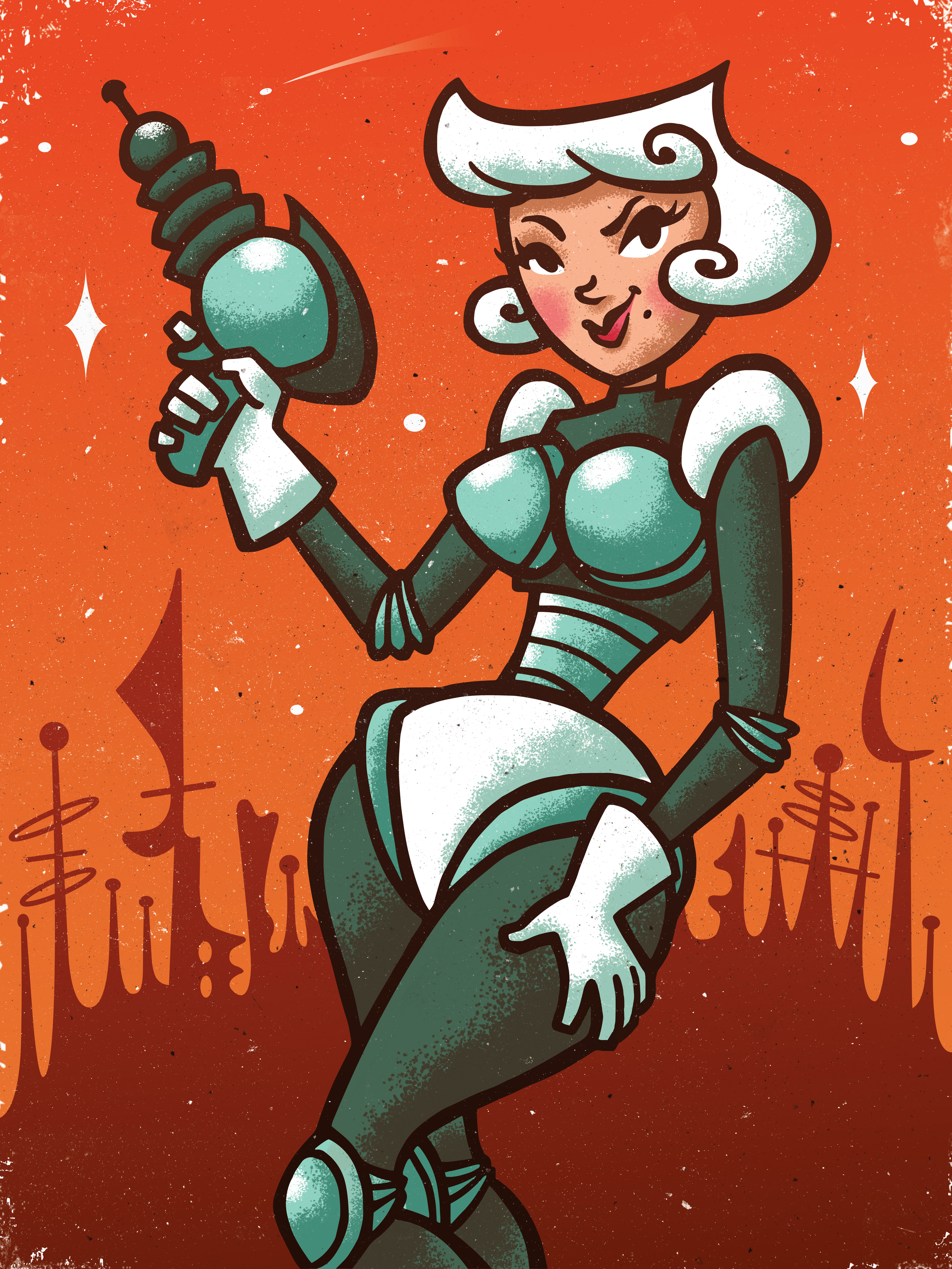
In this image, I created the suggestion of a futuristic cityscape and a night sky as a backdrop by using simple silhouettes and shapes. If you look closely you'll see that the "stars" are mostly white dots and a few curved diamond shapes. The cityscape is a series of abstract shapes made to look like retro structures of some kind. I used simple gradients to color both the cityscape and the sky, letting the sky fade from a saturated to desaturated orange, which contrasts nicely with the silhouette of the cityscape. The cityscape has a subtle gradient going from light brown to darker brown, which gives it the illusion of receding into the background.


