
Archetypes Series: The Fool

Project Scope
This was a school project where I had to create a series of paintings based on a concept of my choosing. Each painting had to be carefully designed to closely represent the concept; meaning every decision, from the composition to the color scheme to the painting style had to be justifiable based on the concept.
This was my letter of intent:
"I'm interested in exploring archetypes and their meanings. Each archetype says something about human nature. Each one has a positive and a negative side. I'm interested to find ways to visually show what each archetype represents in a familiar way, such as portraiture. We all know what portraits are and what they generally look like. Presenting each archetype as a portrait would be an interesting way of personifying the significance of each in a visually interesting and personable way.”
Research
Subjects: Most of my information came from Caroline Myss' site. The information you'll find below is taken from her site. I read about dozens of archetypes and ended up narrowing down my list to these five: Queen, Fool, Prostitute, Knight and Damsel.
Fool
"The [Fool] archetype is associated with three major characteristics: making people laugh, making them cry, and wearing a mask that covers one's own real emotions. The Clown is generally male, with few women playing the role either in literature or the theater. The [Fool] reflects the emotions of the crowd, making an audience laugh by satirizing something they can relate to collectively or by acting out social absurdities. In general, the messages communicated through a [Fool's] humor are deeply serious and often critical of the hypocrisy in an individual or in some area of society. Because of the mask he wears, the [Fool] is allowed--indeed, expected--to cross the boundaries of social acceptance, representing what people would like to do or say themselves."
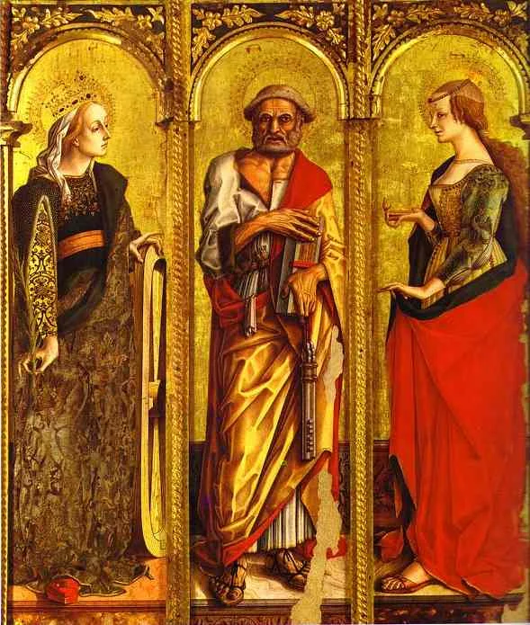
Before I began to develop each archetype, I looked at a variety of things to get some inspiration from. I looked at classic and modern portraits of royalty, Byzantine and religious art, medieval paintings, tarot cards, fairytale illustrations, Pre-Raphaelite paintings, stained glass art, classic Disney princesses, portraits by Tamara de Lempicka, Frida Kahlo, Sofonisba Anguissola, Boticelli, J. C. Leyendecker, Toulouse-Lautrec, and a few others. I looked at everything I could think of that could help me design each character, choose a pose, inspire a style, etc.


References
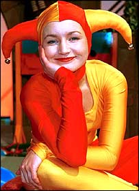
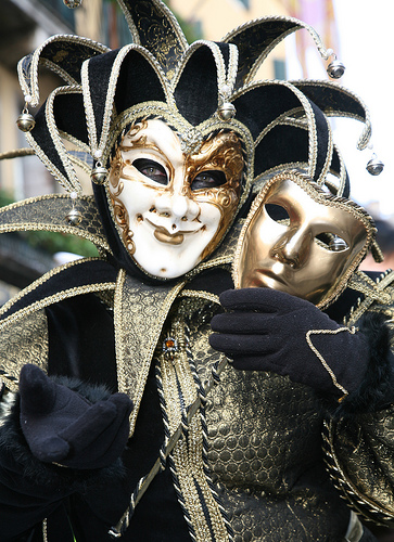
For the Fool, I was very inspired by harlequins and classic paintings of court jesters. I was very interested in using the Fool's costume and composition to portray the archetype's dual nature, representing the bright and dark sides of human nature.


Thumbnails
Court jesters and harlequins are often portrayed looking either pensive and glum, or highly animated, as if in the middle of a performance. I tried these two approaches in my thumbnails.
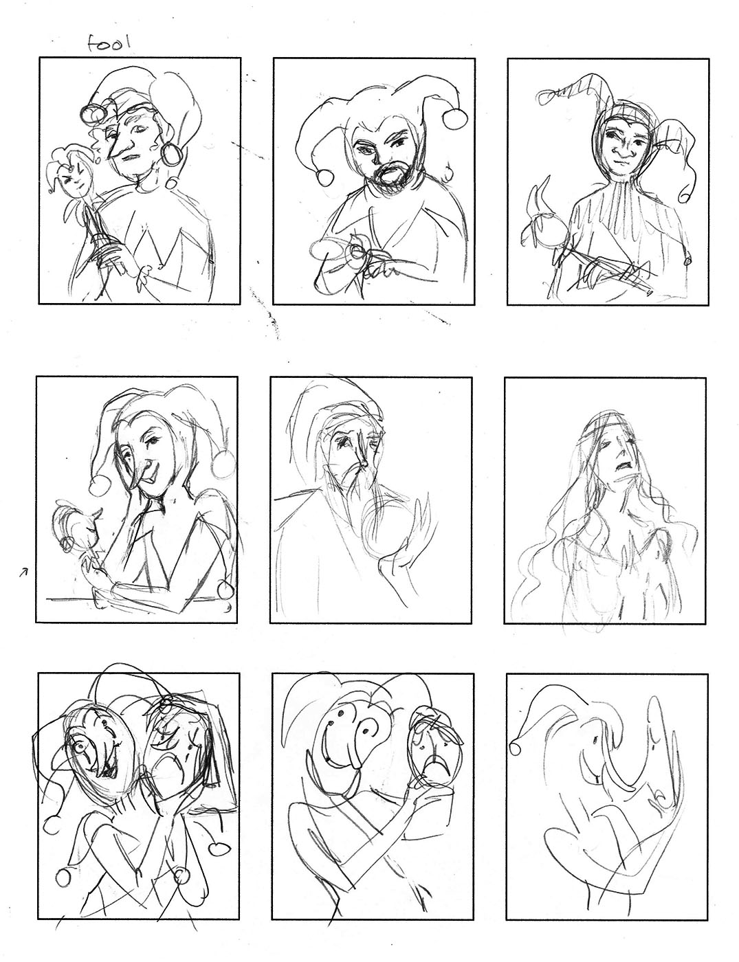
I liked the bottom row best. I was interested in the allegory of portraying the fool in the middle of a performance, wearing a smiling mask, while the second mask he holds in his other hand looks frightened by him. The dark message being you can never trust a smiling face.
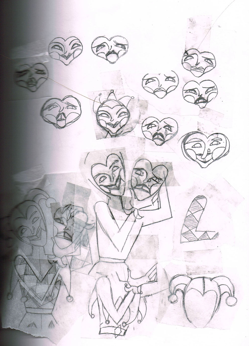
Roughs
I tried out a few poses and slightly more realistic drawing styles at first. In the end I decided to continue with a more illustrative and playful style.

I spent some time working out the details of the Fool's design, like the pose, pattern, ornaments, etc. Using tracing paper was very useful for this. I made lots of different iterations of the mask and the headdress, for example, before I was able to decide on the final design.
Compositional Development
Once I had decided on the style I wanted to use for the series, beginning with the Queen, I adapted my initial rough sketches to that byzantine art and stained-glass inspired look.

I gave the Fool a more rigid pose and finalized his costume design.
Color Breaks
At first I wanted to try using a bright and cheerful palette for the Fool; like something Clopin from The Hunchback of Notre Dame would wear. Once I decided on the color scheme for the Queen, though, I knew I'd have to keep within a more traditional Old Masters palette for the sake of cohesion. It would also give all the portraits the archaic feel I wanted them to have.
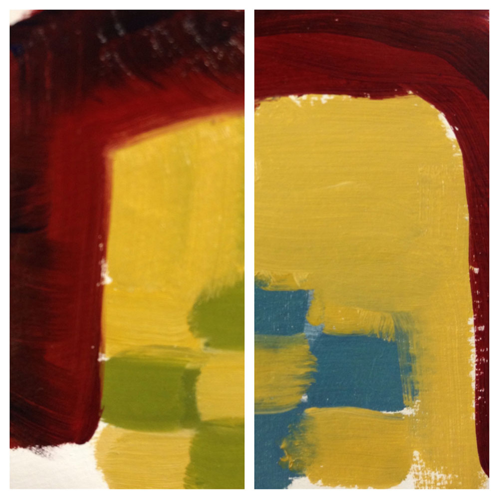

The two color breaks on the left are early attempts, which I wasn't very convinced by. The two on the right look a bit funny because they're just stacked colors, but they were the last two colors breaks I made before I decided on the final color scheme. I had already chosen a red background to represent the Fool’s vivacity and dramatic aspects. Now I just needed to decide whether I wanted the yellow/green checkers or the yellow/blue checkers for the Fool's costume. I decided on the yellow/blue because it had greater contrast, being a warm/cool color scheme vs the yellow/green, which was more warm/warm.
Rendering Process
Now that I knew what color scheme I wanted, I made a quick color reference on paper before I started painting the actual thing on illustration board. I didn't use paint straight from the tube, so making the color reference was helpful in letting me test out different color combinations. That way I had a good idea of which colors and how much of them I would need for the actual painting.

I used illustration board with several coats of gesso. You do not need to gesso your painting surface when you're using acrylic paint, but I'd already primed my boards ahead of time because I originally though I'd be using oils (which do require a primed surface). Illustration board is a bit pricey and the gesso wouldn't really have an effect on the acrylic paint, that's why I decided to use my primed boards.
Color Palette: I used Grumbacher student grade acrylic paints (note I did not use every color on every painting).
- cadmium red light
- alizarin crimson
- yellow ochre
- naples yellow
- cadmium yellow light
- cerulean blue
- ultramarine blue
- titanium white
- ivory black
Painting Process: First, I used a projector to trace my final design onto my board with a pencil.
Working with acrylic paint meant I had to work fast before my paint dried, so I made sure I was ready to sit and paint for a while before I mixed any colors. I mixed each color one at a time, making sure I mixed enough for two-three coats for good opacity. It was a lot like painting by numbers.
I painted all the base colors first, then did the shading and highlights individually, in layers, and finally painted the outlines using a very thin brush. Note that the outlines also required two-three coats of paint. (This last step was very nerve-wracking because if I made any noticeable mistakes it meant I would have to mix one or more colors again and try to match the original shade, which is very hard to do when acrylic paint always looks a little lighter when it's wet than when it's dry!)

