Choosing A Color Scheme
Choosing a color scheme can be a difficult thing, especially when you have little or no understanding of color theory and how it applies to creating an appealing composition. In this tutorial you'll find a process and tips to follow in order to help you choose the right color scheme every time!
The first thing you need to do before you start this tutorial is to make sure you understand the basics of color theory! You can watch the video below or click here: SAT #20: Color Theory Basics

Now that you understand the basics of color theory and know a few important vocabulary terms you’re ready to continue with this tutorial.
What is a color scheme?
- A color scheme is not just a set of colors that look good together.
- Every hue, tint, and shade in a color scheme needs a reason and a purpose for being there. Don’t just throw any of these things in haphazardly.
- A finished piece is not 90% drawing and 10% color. A finished piece is 50% drawing and 50% color scheme.
- Your Color scheme deserves as much attention as your drawing.

How do you choose the colors?
The only thing a color scheme has to have is contrast. Everything else up to you.
This answer is vague because there is no definite way to choose a color scheme. This might seem overwhelming, but don’t worry. This tutorial isn’t over yet!

How do you create contrast?
Contrast can be created by using
- saturation
- temperature
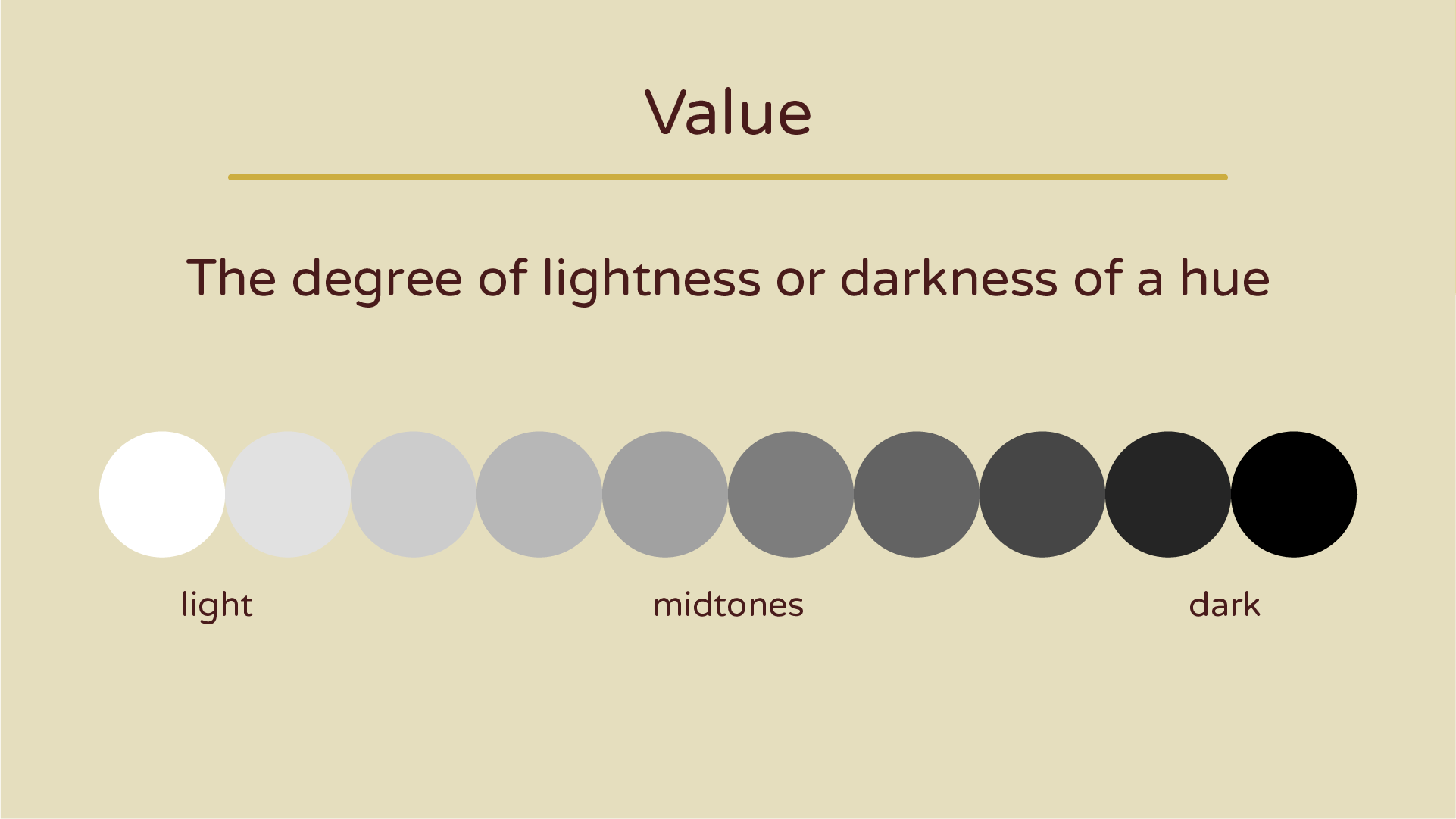
- value


Your color scheme plays as big a role in bringing your piece together as your drawing. This is why you should be thinking of your color scheme even before you start drawing.

Before you start drawing

Step 1. Pre-Plan
Understand what is the purpose of your piece and what mood it should convey.
Using my Robo Girl poster as an example:
Purpose: To be sold as a souvenir poster at a science fiction film festival
Mood: Vivid, exciting, retro sci-fi

Step 2. Research
Search for examples of existing works that have a similar purpose and mood to the one you want to create.
I researched retro science fiction film posters and lots of other things related to them.


Step 3. Visualize the end product
Think about what you want the end product to look like. This can be a bit difficult, but try your best to visualize it as clearly as you can.
If you read the case study for this poster, you’ll see that at the very beginning I didn’t have a very clear idea of what I wanted this poster to look like. I considered many different ideas before I decided on the robot girl pin-up. This is definitely allowed. You won’t always start a project knowing exactly what you want. The point is to continue to visualize the end product every step of the way so you don’t get stuck on minor details and lose track of what your final goal is.

Now you can continue with the development process for your drawing or design, making thumbnails, roughs, tights and so on.
You might want to check out SAT #2: Start With Thumbnails

After your drawing is developed

Step 4. Make Color Breaks
make color breaks to test out a your ideas and see what works best. You can do as many as you need to until you find one you’re really sold on.
These are some of the color breaks I made for the Robo girl poster.

Step 5. Choose A Color Scheme
Make sure you choose the color scheme that best suits your intended purpose and mood.
I ended up choosing this one because it was the most appealing and I felt it fit my purpose and mood really well.

Color Scheme Analysis
I’ve broken down this color scheme to help you see how color theory plays a role in this piece.
Saturation
- mostly saturated colors
- appears bright and exciting
- in line with an adventure sci-fi theme
Temperature
- Complementary color scheme
- warm: red-oranges
- cool: blue-greens
Value
- balanced value range
- the figure uses the darkest shades in the line, pushing it forward
- background uses value contrast and no line to let the figure be the focal point

More Examples!
Here are three more examples using completely different artworks.

Job Ad by Alphonse Mucha (1989)
A poster ad for Job cigarette paper
Purpose: make people want to buy this product
Mood: elegant, sensuous

Color Scheme
Saturation: saturated background & desaturated foreground
- desaturated figure is pushed forward
- saturated elements and the background recede
Temperature: Triadic color scheme
- warm: orange (desaturated)
- cool: green (desaturated) and purple
Value: moderate value range
- mostly mid-tones
- not a lot of light-lights and dark-darks
- line using the darkest shade helps to push the figure forward
Conclusion: Saturation and temperature create the most contrast in this piece.
The gem tones create a sense of elegance and luxury, while the desaturated oranges make the lady appear goddess-like.

La Troupe de Mademoiselle Eglantine by Henri de Toulouse-Lautrec (1895)
poster ad for a cancan dance show
Purpose: Make people want to attend the show
Mood: vibrant & lively

Color Scheme
Saturation: largely desaturated
all colors look watered down
even the dark brown looks sandy
Temperature: mostly warm color scheme
warm: yellows, oranges, warm brown (desaturated)
cool: blue-green (desaturated)
Value: strong value contrast
the darkest shapes are the women's legs
everything else almost disappears in comparison
Conclusion: Value creates the most contrast and fulfills the purpose of the poster by really selling you the experience of the cancan dance (where legs are showing constantly).

Impression, Sunrise by Claude Monet (1872)
an impressionist painting of a sunset
Purpose: portray the colors of a sunrise
Mood: calm & melancholic

Color Scheme
Saturation: desaturated
- all colors appear washed out or greyed out
- even the orange (which looks saturated in the painting) is actually a light coral color
Temperature: mostly cool with a few warm accents
- based on a complementary pair (orange & blue)
- cool: blues and greens
- warm: oranges
Value: very limited value range
- mostly mid-tones
- barely any light-lights or dark-darks
- note that the sun is almost unrecognizable
Conclusion: This painting relies almost exclusively on temperature to create contrast. The desaturated colors and low value contrast help create the calm, melancholic mood.

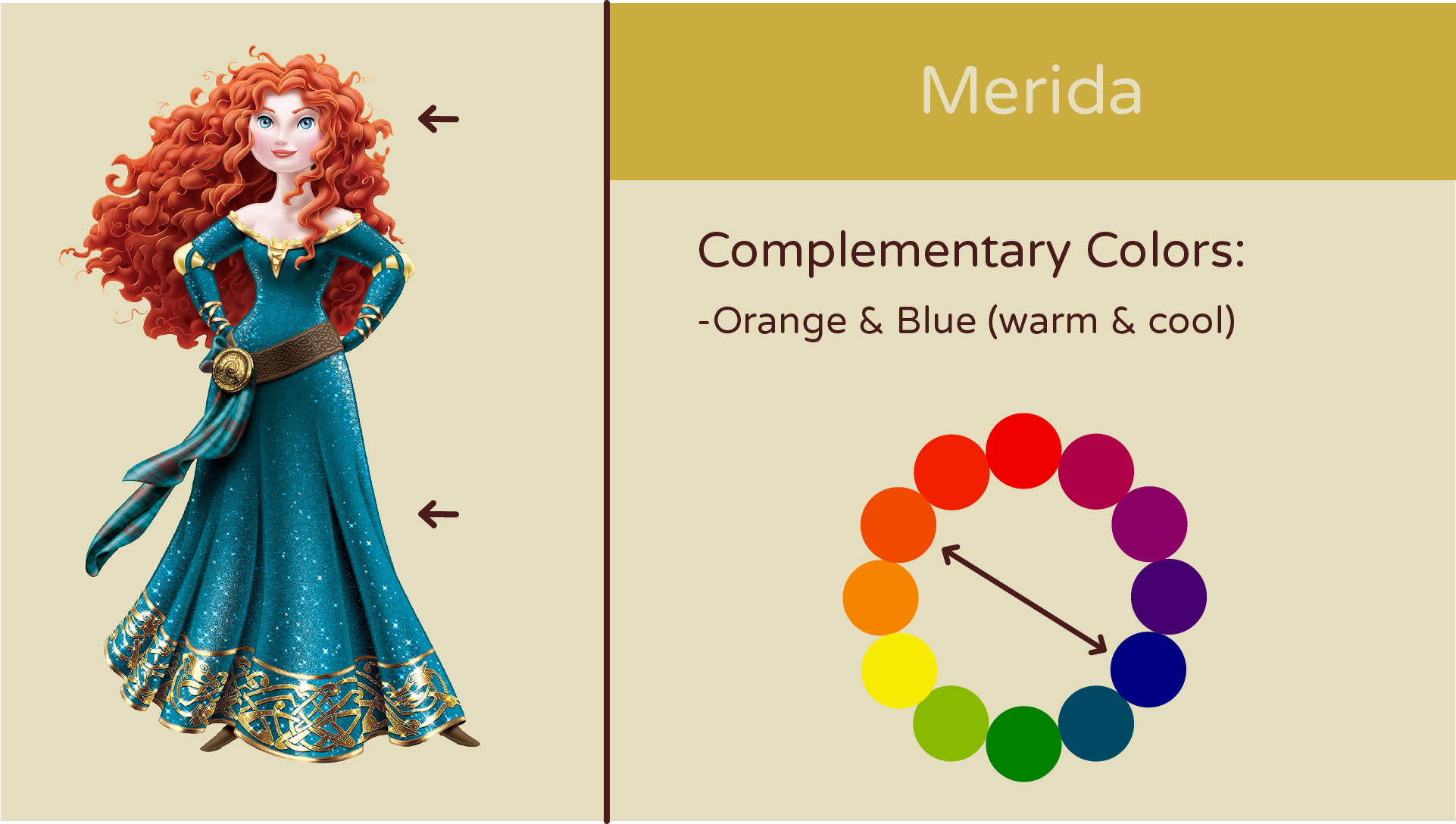
Bonus Examples
Examples of Disney characters whose color schemes exemplify color theory 101!