

Archetypes Series: The Queen

Project Scope
This was a school project where I had to create a series of paintings based on a concept of my choosing. Each painting had to be carefully designed to closely represent the concept; meaning every decision, from the composition to the color scheme to the painting style had to be justifiable based on the concept.
This was my letter of intent:
"I'm interested in exploring archetypes and their meanings. Each archetype says something about human nature. Each one has a positive and a negative side. I'm interested to find ways to visually show what each archetype represents in a familiar way, such as portraiture. We all know what portraits are and what they generally look like. Presenting each archetype as a portrait would be an interesting way of personifying the significance of each in a visually interesting and personable way."

Research
Subjects: Most of my information came from Caroline Myss' site. The information you'll find below is taken from her site. I read about dozens of archetypes and ended up narrowing down my list to these five: Queen, Fool, Prostitute, Knight and Damsel.
Queen
"Besides having a rulership position in a court, the Queen represents power and authority in all women.The Queen archetype is also associated with arrogance and a defensive posture that is symbolic of a need to protect one's personal and emotional power. The benevolent Queen uses her authority to protect those in her court, and sees her own empowerment enhanced by her relationships and experience."

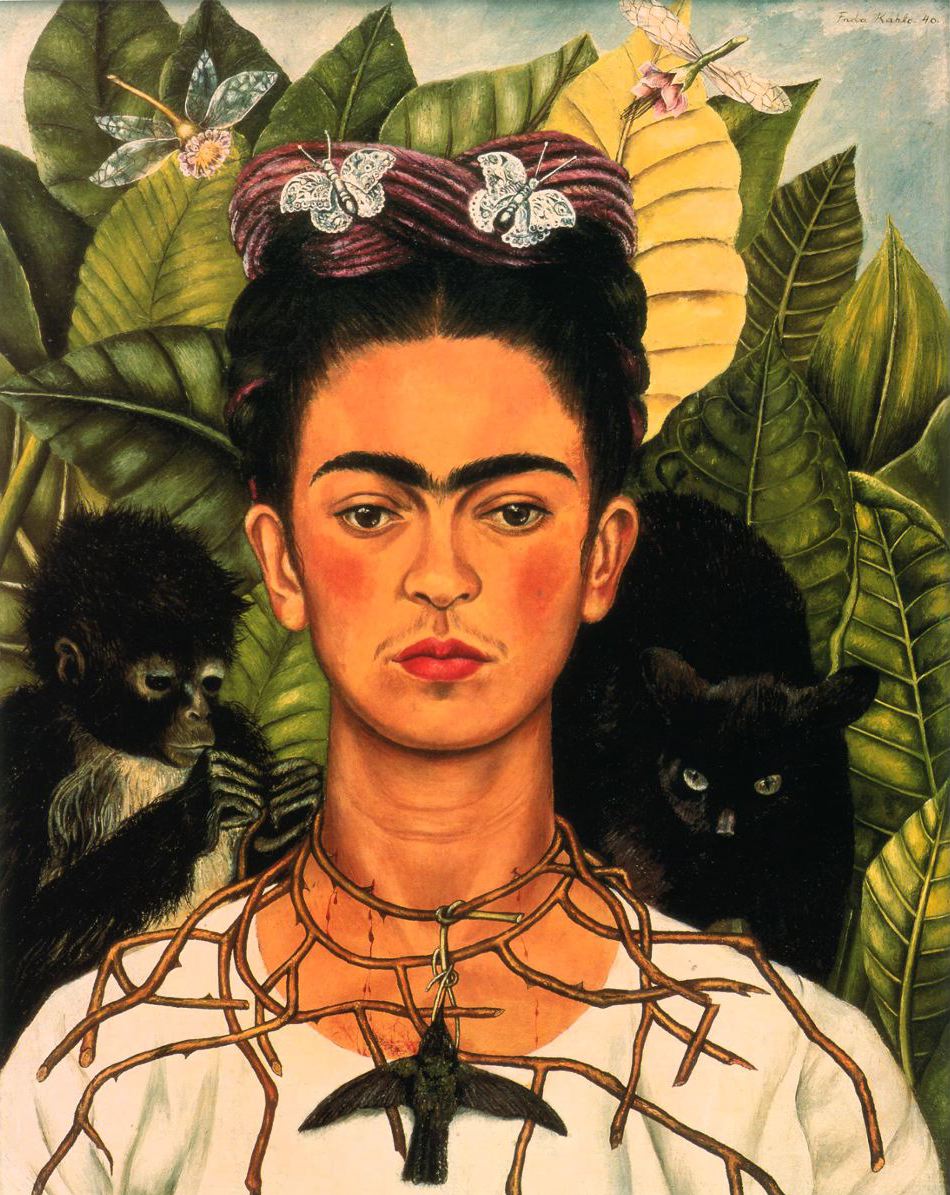
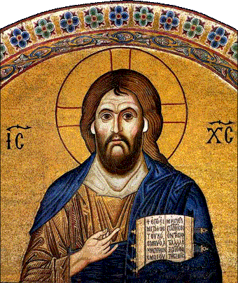
Before I began to develop each archetype, I looked at a variety of things to get some inspiration from. I looked at classic and modern portraits of royalty, Byzantine and religious art, medieval paintings, tarot cards, fairytale illustrations, Pre-Raphaelite paintings, stained glass art, classic Disney princesses, portraits by Tamara de Lempicka, Frida Kahlo, Sofonisba Anguissola, Boticelli, J. C. Leyendecker, Toulouse-Lautrec, and a few others. I looked at everything I could think of that could help me design each character, choose a pose, inspire a style, etc.


References
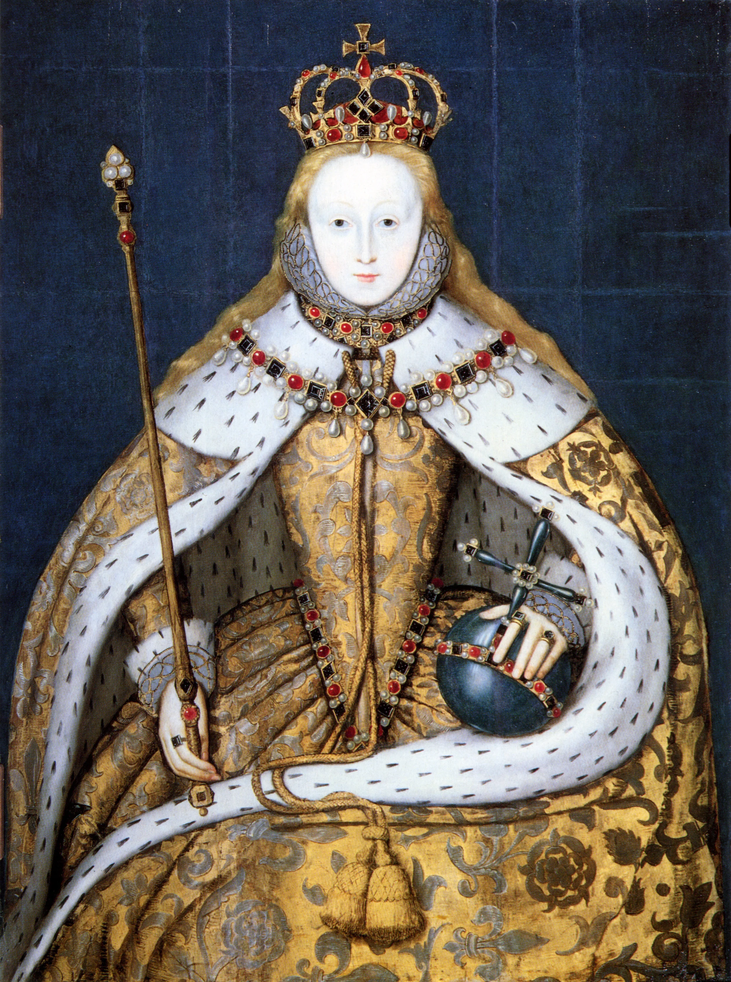
For the Queen's portrait, I was particularly inspired by Elizabeth I's coronation portrait. I felt that her posture being head-on, with her hair down and her crown and jewels prominently displayed was a great visual representation of her power as queen. She doesn't look weak or coy. She looks feminine, confident, and tough, which is how I felt my Queen should portray herself.

I also looked at other classic royal portraits like Napoleon and queen Victoria, and Pre-Rapahelite paintings depicting beautiful women in romanticized costumes and regal settings.


Thumbnails
I wasn't very thrilled with my first few thumbnails, but I kept developing the composition, hoping I would eventually come up with something more exciting.


Back to the Drawing Board
After working on the images below, I felt the direction I was going in wasn't exactly what I wanted. I wasn't excited about continuing with what I had, so I decided to go back to the drawing board and see if I could come up with something more illustrative and playful.


Brainstorming
Once I started doodling, new ideas started to flow and soon I had a new direction to go in. I used a lot of tracing paper to help me further develop the queen's design. It was particularly useful in allowing me to try out different hair ideas, jewelry, and outfits.


Roughs
Now that I had a good starting point, I began to solidify the Queen's pose. The placement of her hands and arms were particularly difficult to decide on (as you can see from all the variations I layered on the sketches below).


Compositional Development
I decided to stretch my existing rough sketch to make the queen wider and less elongated (compare the two images on the left). I felt that the wider composition not only looked better compositionally, it was also a common theme in the many royal portraits I referenced for the sitter to take up a lot of visual room. It shows the person’s wealth and power, as well as emphasizes the importance of the person when their body and possessions take up over 60% of the composition. From then on I solidified the queen's pose and wardrobe, referencing real crown jewels and court fashion from the mid 1500's.

The most significant decision I made at this point was to let the Queen's hair down instead of leaving it in the net. I'd been questioning whether the loose hair would make her appear too young and therefore closer to the Princess/Damsel archetype. Referencing the coronation portrait of Elizabeth I, I decided that the loose hair would not only look nicer compositionally but also portray my Queen in a way that would mirror Elizabeth I.
I won't go too much into detail, but Elizabeth I used her portraits to influence the way her subjects thought of her, especially with her coronation portrait, which was meant to portray her as a young, powerful and capable monarch (as in capable of ruling without a king). I felt that was an appropriate way to portray the Queen, who, according to Myss, "represents power and authority in all women."
The stylization of this piece was key in determining the style that I'd use for the entire series, as the Queen was the first archetype I worked on. I decided to stick with a style similar to that of playing cards. I felt the flat, semi-geometric style would give the archetype portraits a stately, regal feel that would prompt the audience to question who the characters were and what made them important.
Analysis: Besides the prominent crown and large bejeweled necklace, what makes my portrait a complete embodiment of the Queen archetype is her proud, calm posture, the rich colors of her clothing, the volume and fullness of her long hair, the opulent texture of her dress, especially the large extravagant sleeves, and the confidence with which she rests her hands over her lap.

Color Breaks
I considered several difference color schemes for the Queen, mainly including jewel tones like red, deep blue, purple, and green.
I chose the queen’smain colors (red and green) to be symbolic of her wealth and stature. Red is a color that is visually striking, commanding attention, and symbolic of power. It is a common color used by royalty, as well as green. Red and green are also complimentary colors in the color wheel, which guarantees they will create nice visual contrast. (I apologize for not having any images to share, unfortunately I wasn’t able to find any pictures of the physical color breaks I originally painted.)

Rendering Process
I made a rough color break (left image) before I began painting so I knew exactly what colors I needed to use. The next image was done with oils, which I had originally wanted to use for this project. However, I soon realized that using oils wasn't the best way to achieve the "dry" look I was envisioning for the series. I then decided to restart the painting using acrylic paint, which dries very fast (unlike oils) and would be well suited for the painting style I wanted.
image
I used illustration board with several coats of gesso. You do not need to gesso your painting surface when you're using acrylic paint, but I'd already primed my boards ahead of time because I originally though I'd be using oils (which do require a primed surface). Illustration board is a bit pricey and the gesso wouldn't really have an effect on the acrylic paint, that's why I decided to use my primed boards.
Color Palette: I used Grumbacher student grade acrylic paints (note I did not use every color for every painting).
- cerulean blue
- ultramarine blue
- titanium white
- ivory black
- cadmium red light
- alizarin crimson
- yellow ochre
- naples yellow
- cadmium yellow light
Painting Process: First, I used a projector to trace my final design onto my board with a pencil.
Working with acrylic paint meant I had to work fast before my paint dried, so I made sure I was ready to sit and paint for a while before I mixed any colors. I mixed each color one at a time, making sure I mixed enough for two-three coats for good opacity. It was a lot like painting by numbers.
I painted all the base colors first, then did the shading and highlights individually and finally painted the outlines using a very thin brush. Note that the outlines also required two-three coats of paint. (This last step was very nerve-wracking because if I made any noticeable mistakes it meant I would have to mix one or more colors again and try to match the original shade, which is very hard to do when acrylic paint always looks a little lighter when it's wet than when it's dry!)

