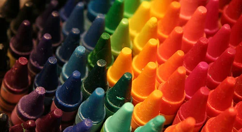
Create Color Breaks

So you started with thumbnails, worked those into roughs, picked your favorite one and refined that into a tight sketch. You have your composition as close to done as you can get it. You got rid of any design kinks and you feel ready to move on to the final rendering stage. Now what?
You may or may not have a clear idea of what you want your final colored piece to look like. I often don’t. I like to focus more on the design and layout of a piece at the beginning of a project. Once I’ve done that part, I create color breaks.
Color breaks are basically color mock-ups. They’re very similar to thumbnails in that they’re rough versions of an idea. They’re meant to give you a general sense of what the final piece will look like without the pressure of having to commit to any of them. The amount of color breaks I create depends on how clear or vague of an idea I have of what I want. As often happens with thumbnails, experimenting with color breaks can lead you to a pleasantly unexpected solution.


These are the color breaks I started with for my Robo-Girl poster. I had no idea what type of palette I wanted to use for this, so I started with a variety of colors. My first couple of breaks were inspired by a modern video game-type look. I was thinking of Metroid.

I wasn’t really liking that look, so I decided I wanted my poster to have a vintage look based on the target audience (this was a school assignment, so I had a client and specific criteria to meet. It wasn’t just based on what I like and don’t like). I decided to use a limited palette (fewer colors) to support the vintage look. I also moved away from dark and saturated colors and began focusing on finding color combinations that appeared old-timey. I looked at stills from The Jetsons and other vintage sci fi illustrations that had the feel I wanted my poster to have and used those as color references.
You can see how different the color scheme I started out with is from the final one. I could have used the very first one I made and not gone through the trouble of creating any more, but notice it would’ve been a completely different piece. I’m much happier with the piece I ended up with because it has the effect I wanted it to have. It meets the client’s expectations and appeals to the target audience.

As the artist, it is your job to make effective decisions based on your vision. It’s not enough to just slap some color on a drawing and call it a day. Anyone can do that. The decision-making process is what separates the professional artist from the hobbyist.

This is the process I use to pick a color scheme. What happens after that depends on what medium I want to use, the level of detail I want the piece to have, etc. Almost every project is a different experience for me.
I don’t like being closed-minded about my art. I like considering many different options because I don’t pretend to be perfect and I like trying new things. This makes the process more interesting for me and allows me to experiment and grow as an artist.
I use this process with both digital and traditional media. Pre-planning this way saves me the trouble of fixing things while I’m already in the process of rendering. It also allows me to familiarize myself with my color palette before I start. This is particularly helpful when I’m using any type of traditional paint, where I have to mix my own colors. This is why creating color breaks can be a very effective way to improve your work flow.
To some of you, this process may seem tedious and even counter-intuitive. Some people like a more organic process of developing their images. That’s okay. I still suggest you try creating color breaks before jumping into the rendering stage, just so you can confidently say that this is not a process that works for you. You’ll never really know until you try it, right?